Portfolio
 web3, DeFi
Turned a complex, data-heavy desktop product into an intuitive mobile experience
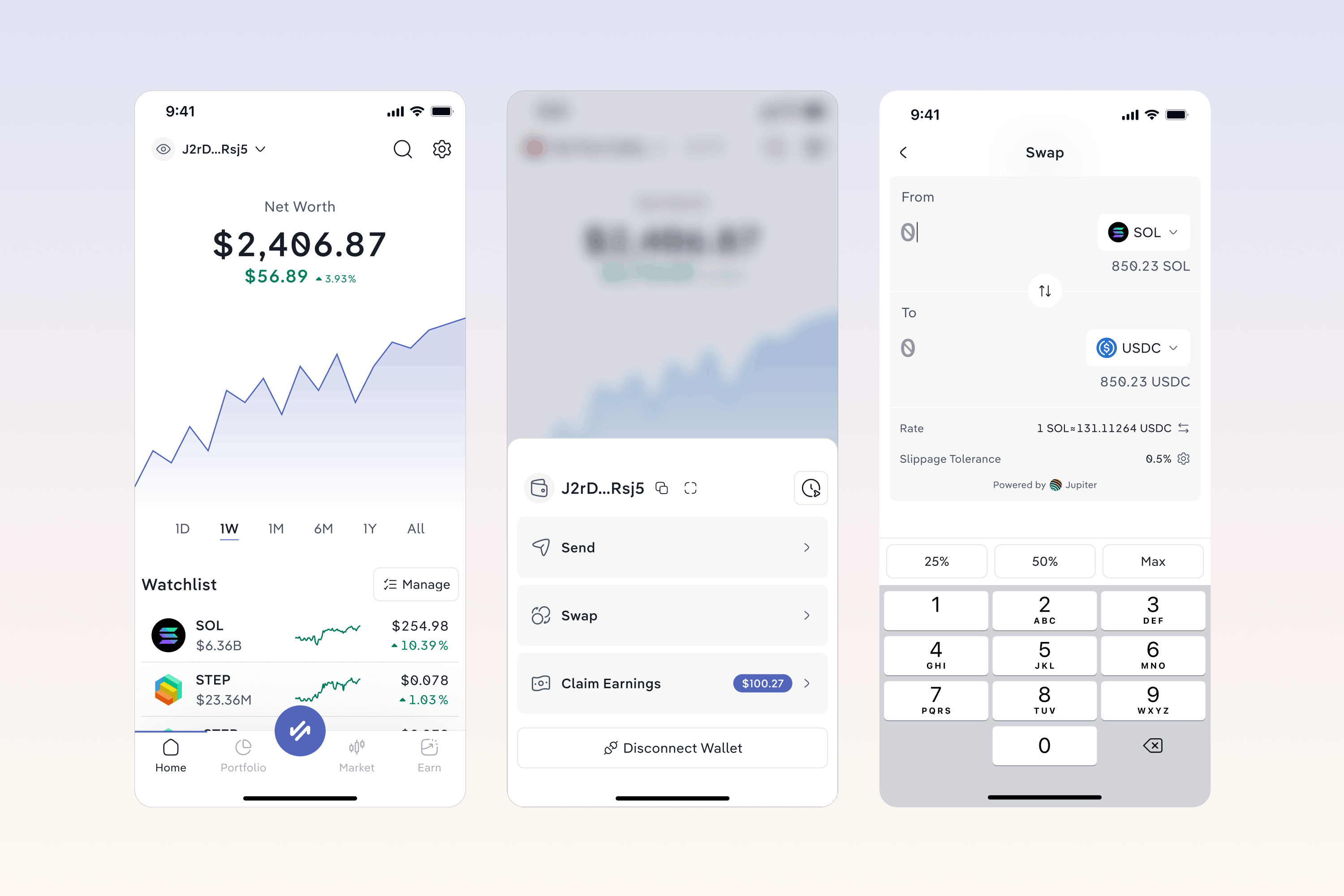
Designed Step Wallet from the ground up, from the core product experience to a new brand identity for Step.
From desktop dashboard to mobile wallet
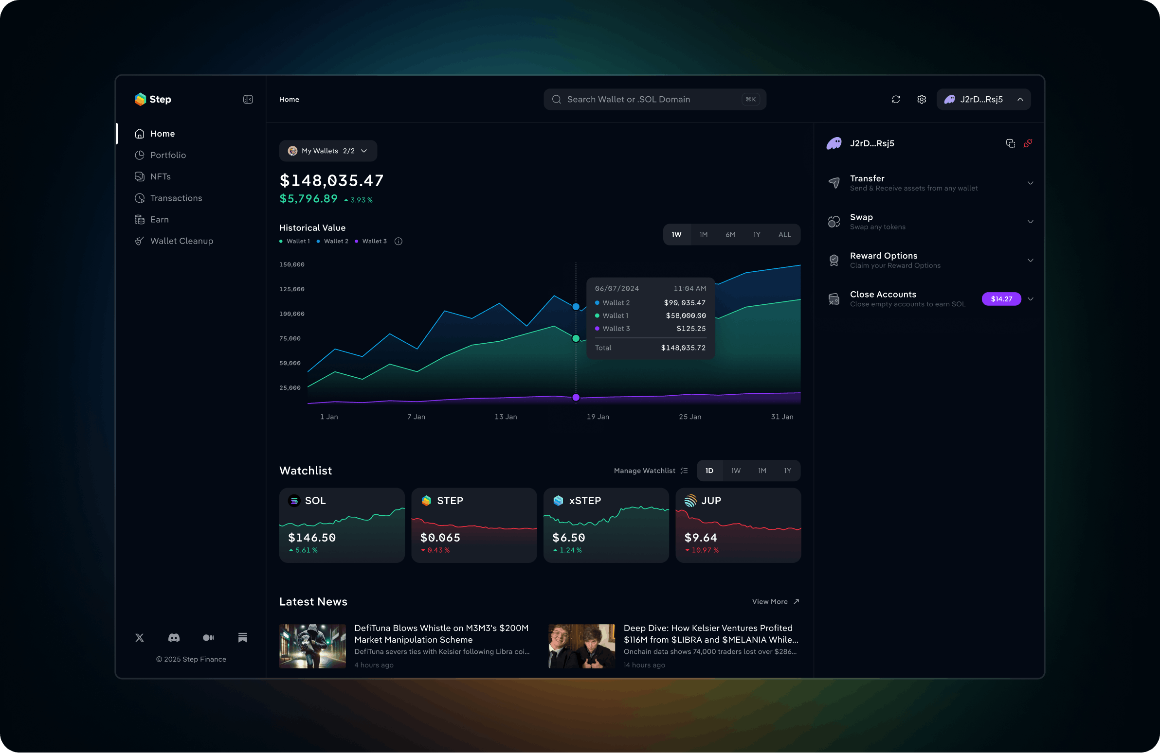
Step started as the first portfolio dashboard on Solana, built to give DeFi users a complete view of their assets and positions across the ecosystem. Over time, it grew into a powerful desktop product used by hundreds of thousands of users.
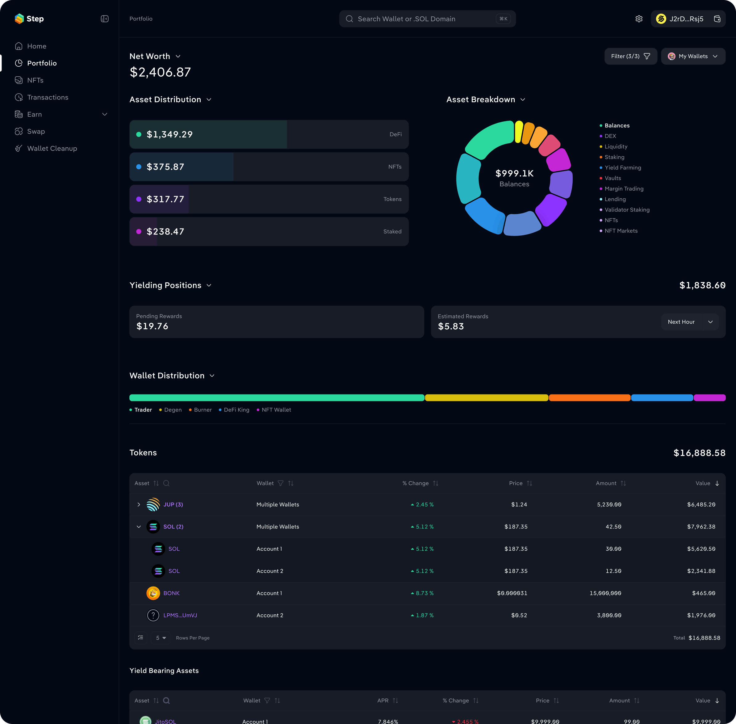
But the way people were interacting with crypto was changing. Mobile was becoming increasingly important, and Step saw an opportunity to evolve beyond portfolio tracking into a product where users could not only understand what they owned, but also take action.
The challenge wasn't simply adapting a dense desktop dashboard to a smaller screen. We had to rethink what Step should feel like on mobile: what information needed to stay immediately accessible, what could be simplified, and how wallet functionality and DeFi actions could become part of the same experience.
The goal was to preserve the depth that made Step valuable to experienced users, while making the product approachable enough for people unfamiliar with web3.
Evolving Step into a more human experience
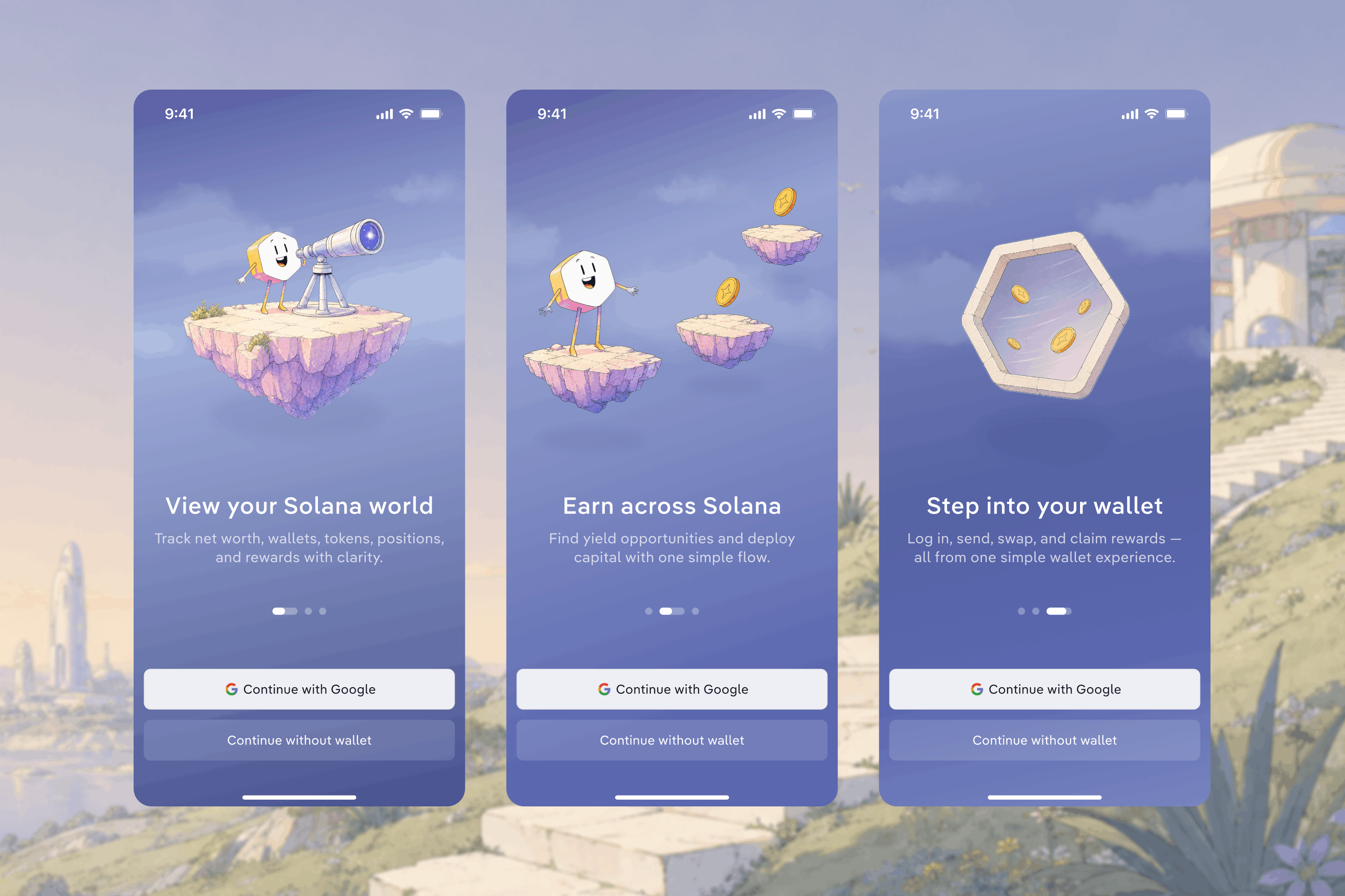
Crypto products can feel technical and intimidating so we wanted Step to feel more approachable. As the product evolved from a portfolio dashboard into a broader mobile experience, we refreshed its visual identity and brought the new direction into the product through color and illustrations.
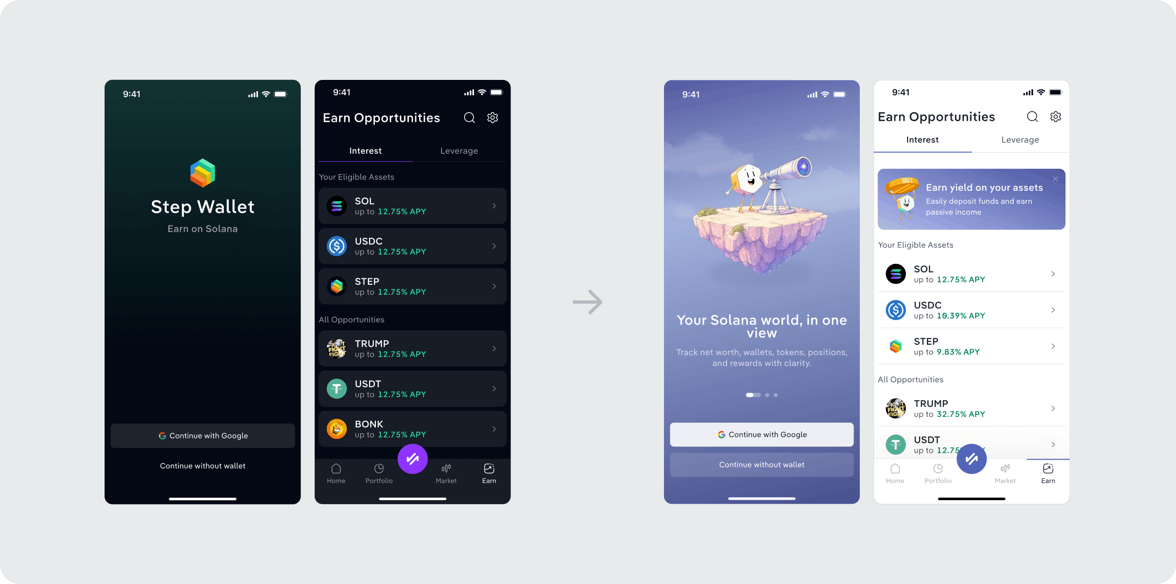
Illustration and the Step mascot became part of the experience, bringing personality to otherwise functional moments. We used them across onboarding, empty states, transaction feedback, errors, and success moments. This helped make the product feel friendlier and more reassuring without sacrificing clarity.
Making complex portfolios easier to manage
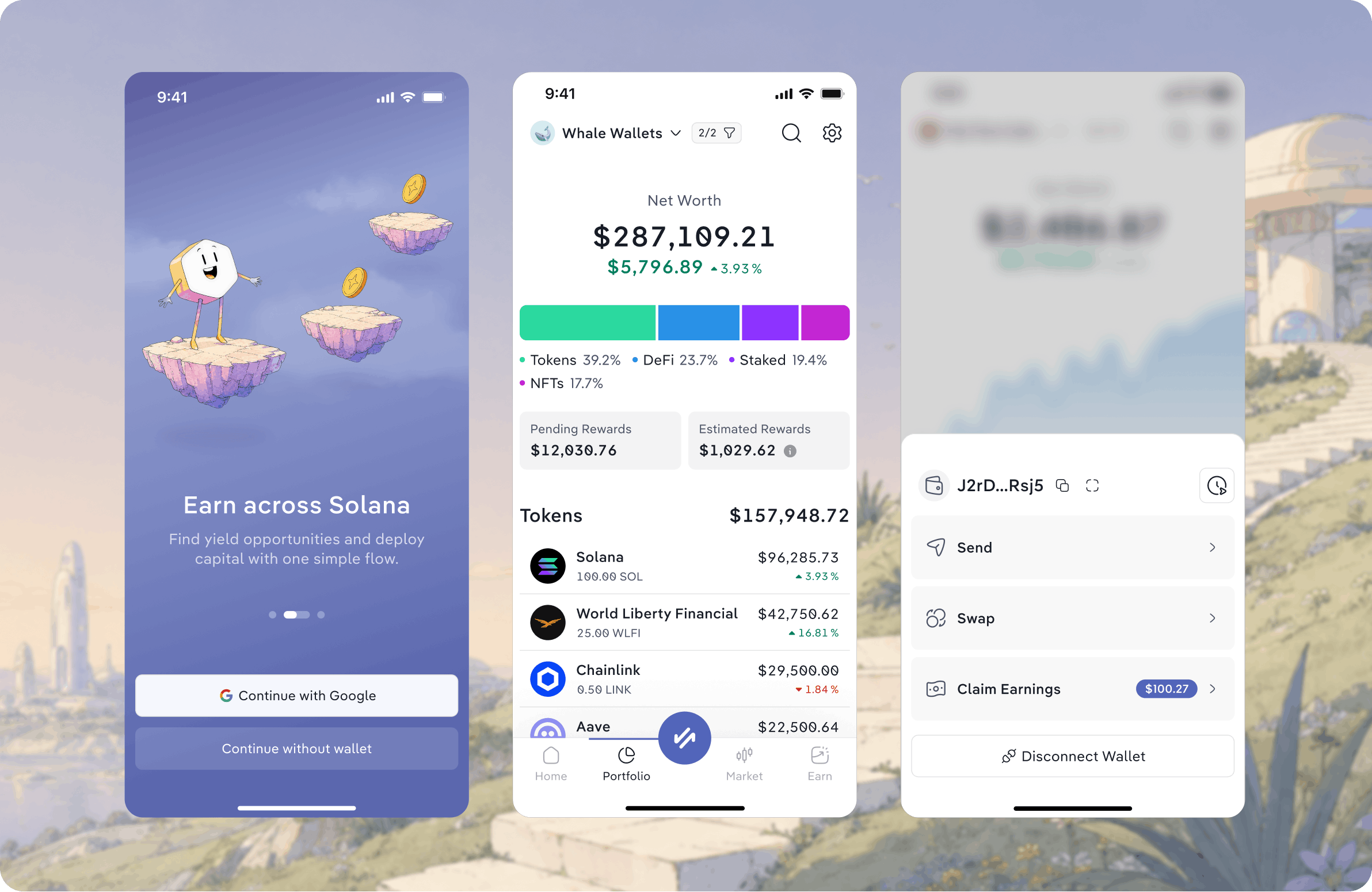
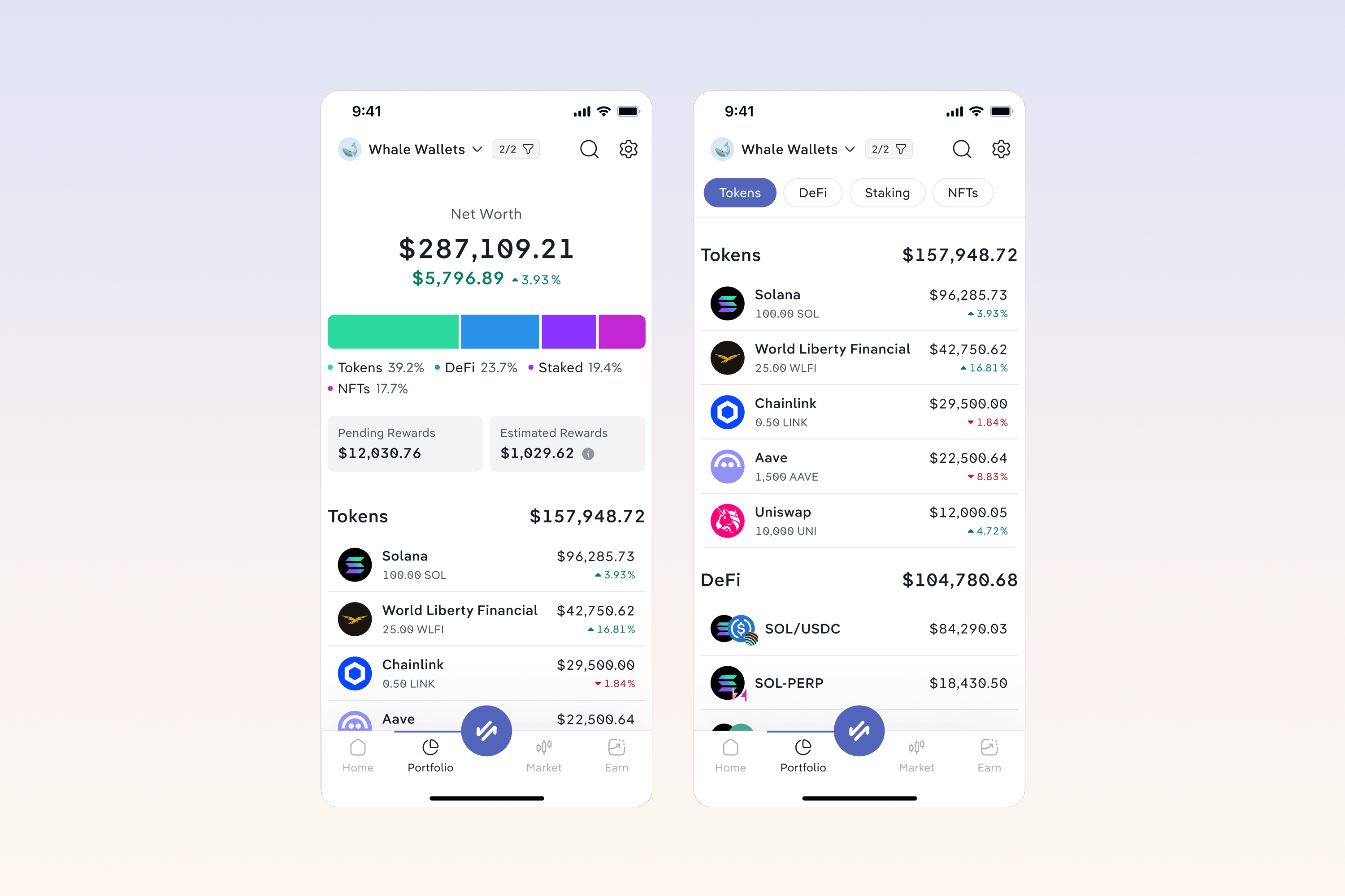
A single Solana wallet can contain much more than a list of tokens: from NFTs and DeFi positions to multiple accounts and assets users may not even recognize. On desktop Step could surface much of this information at once. On mobile that same level of detail quickly becomes overwhelming. The challenge was creating a clear hierarchy without taking away the depth that made Step useful.
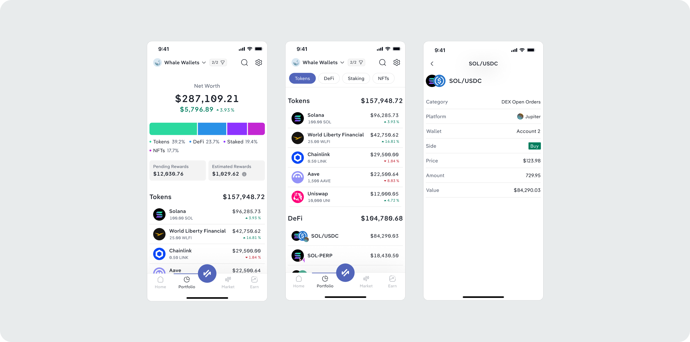
We prioritized the information users needed most, grouped different types of assets into a more scannable structure, and kept deeper details and management actions accessible when needed. We didn't show less but made a complex portfolio easier to understand and navigate on a smaller screen.
Bringing DeFi into the wallet
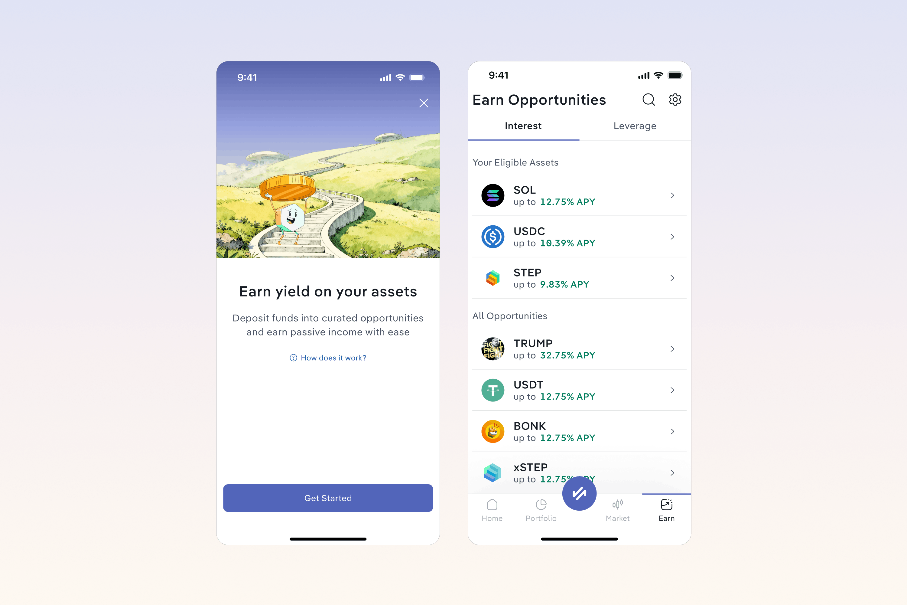
Step was already a place where users could discover and track DeFi opportunities but taking action often meant leaving the app, navigating to an external protocol, connecting a wallet and finding the right pool again. With Earn we brought that experience directly into the wallet. Users could discover opportunities, understand the strategy and expected returns, deposit in a few steps and track their position. All without leaving Step.
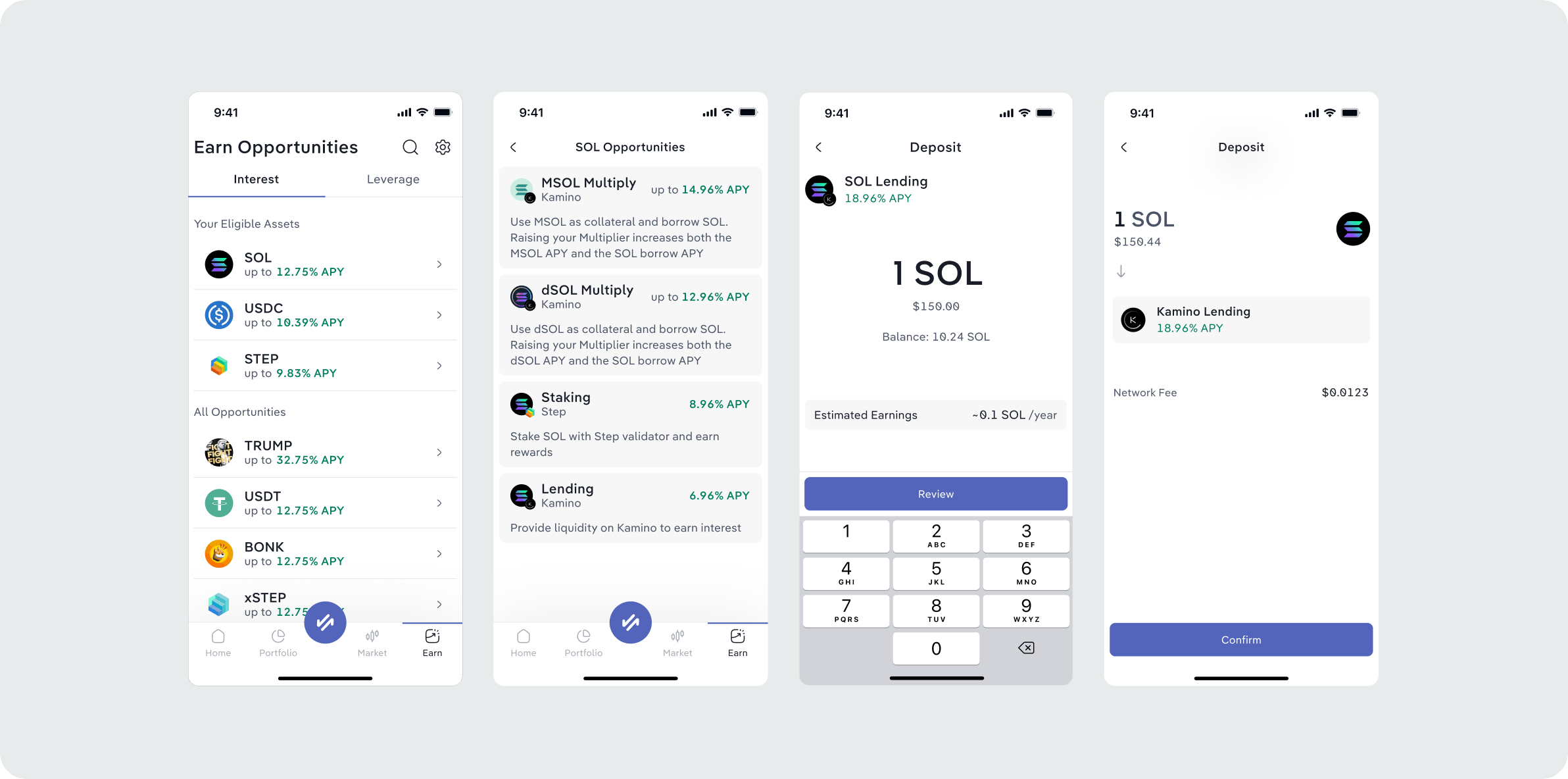
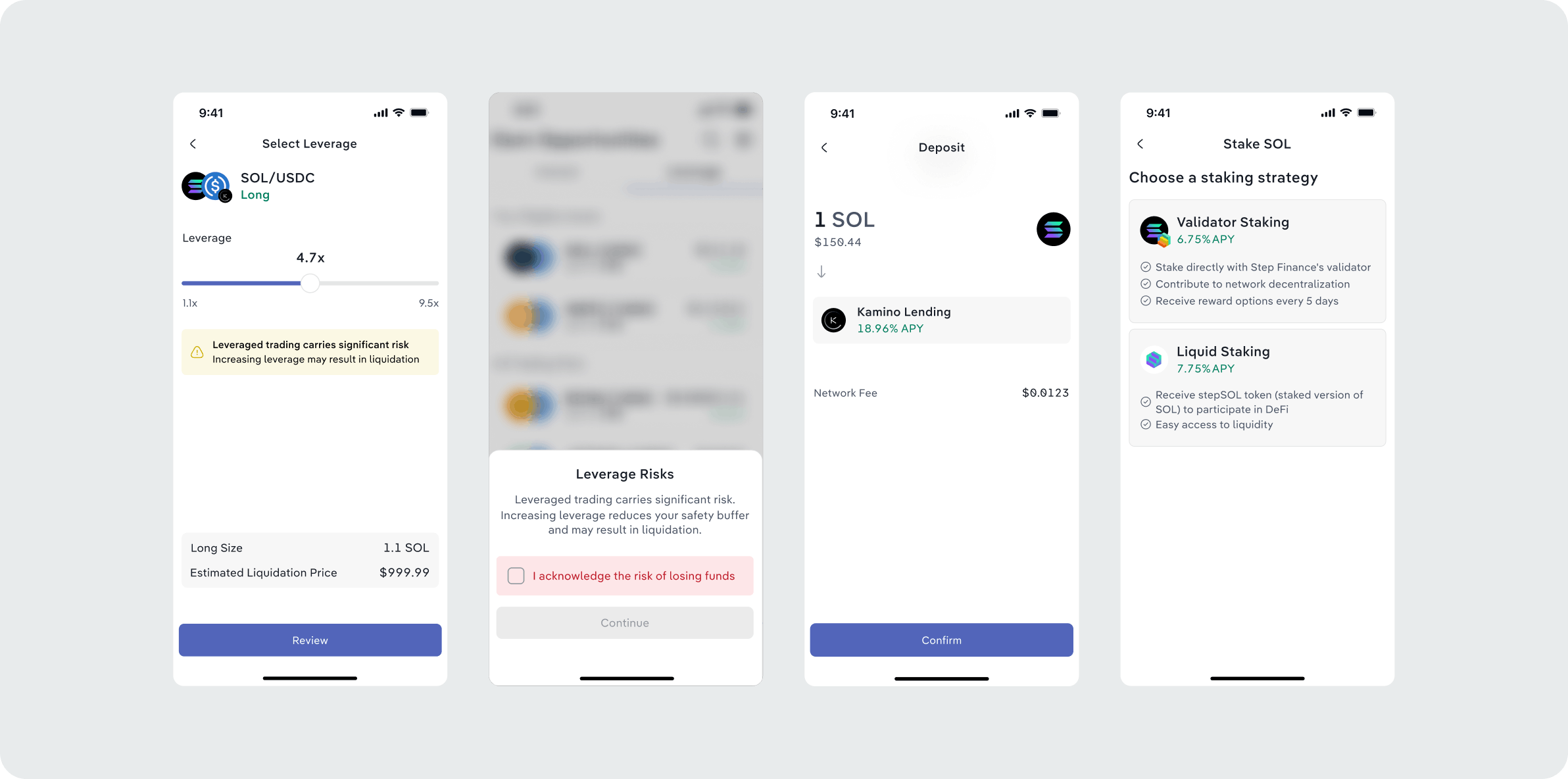
The challenge was simplifying DeFi without oversimplifying it. Users needed an easy way to compare opportunities and deposit while still understanding what was happening behind the scenes: where their assets were going, how returns were generated, what risks were involved, and what to expect after depositing. Rather than hiding this complexity, we focused on revealing the right information at the right moment, keeping the main flow simple while making deeper details easy to access when needed.
Designing around real blockchain constraints
Crypto comes with constraints that don't exist in traditional apps. Transactions can require multiple signatures, hardware wallets introduce additional steps and losing access to a wallet's authentication method can mean losing access to the wallet itself.
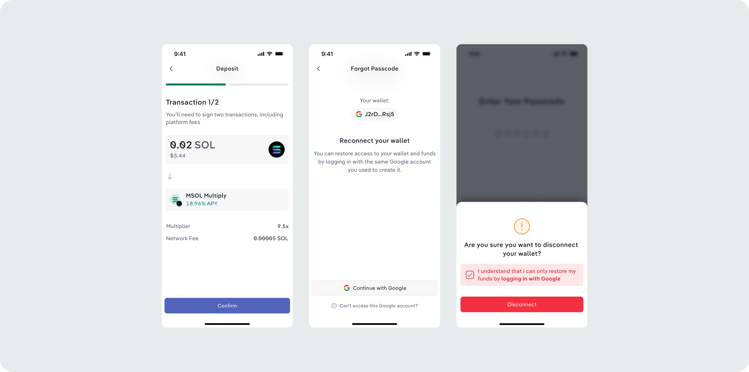
These moments required extra care. We used clear warnings, confirmations, and guidance to make consequences visible before users acted, especially around irreversible or security-sensitive actions. The goal was to help users understand what was at stake and make informed decisions without requiring deep knowledge of how the blockchain works.
The complete Step experience
Over 9 months I led product design across Step's mobile experience. I worked closely with engineers to find solutions around technical constraints, gathered feedback from users and iterated based on their needs.
Alongside the product work I worked with our brand designer on Step's visual rebrand. Together we shaped the new creative direction.
The result was a more approachable and complete Step experience that preserved the depth valued by experienced Solana users while making everyday crypto interactions easier for newcomers.
Next project
Redesigned and expanded the platform with new features
Simplified complex on-chain experiences.View Case Study