Portfolio
 web3, DeFi
Redesigned and expanded the platform with new features
Simplified complex on-chain experiences.
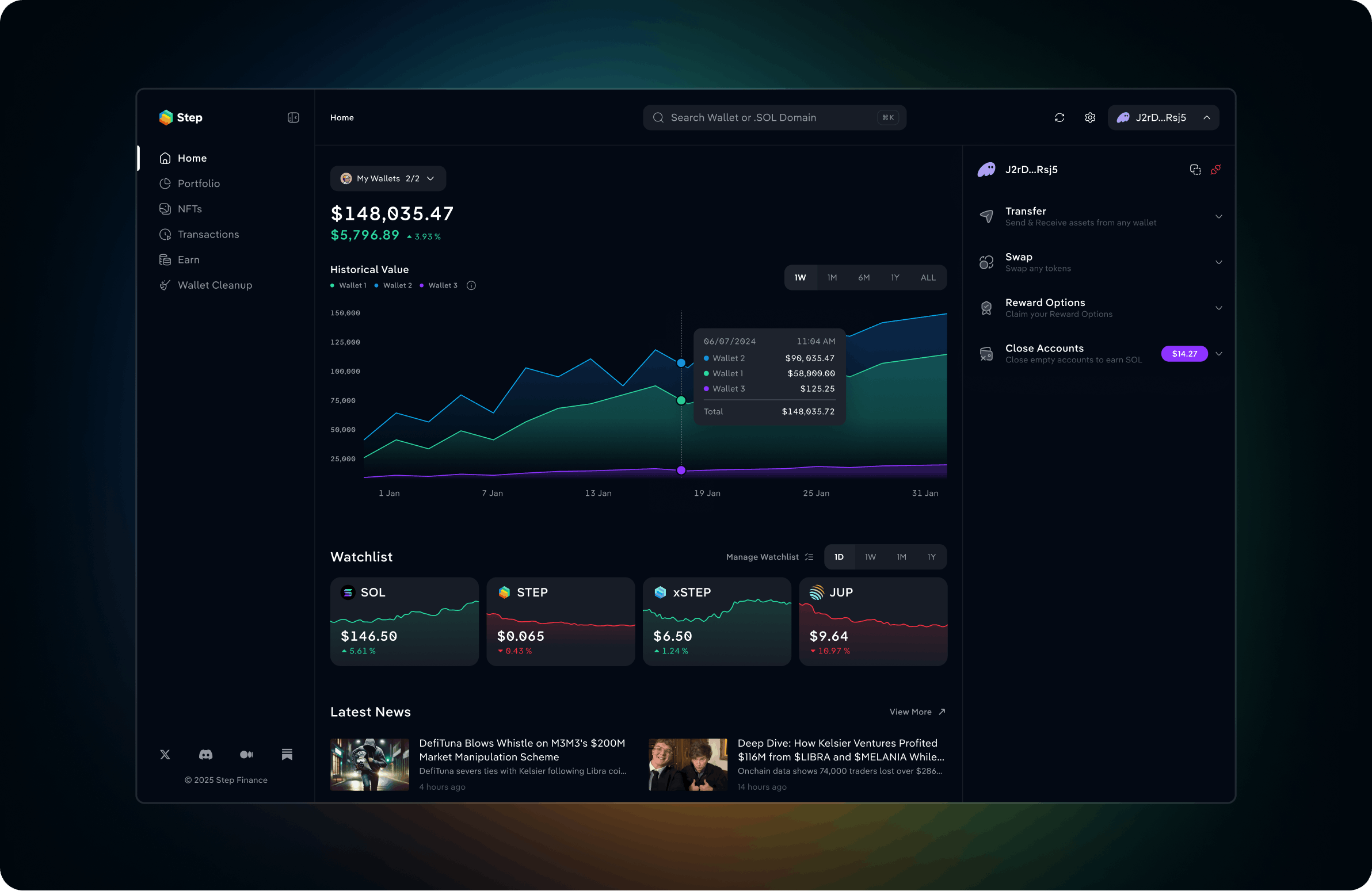
Building on a new foundation
Step Dashboard is a portfolio platform that gives Solana users a complete view of their on-chain assets: tokens, NFTs, DeFi positions, LPs, vaults and more.
When I joined Step the team had just launched V3, a major redesign and technical rebuild of the dashboard. The first release established a new visual direction and product foundation but intentionally launched as an MVP without the full functionality.
My role was to build on that foundation: bring essential functionality from V2 into the new experience, improve existing flows, expand the design system, and design new features as the product evolved.
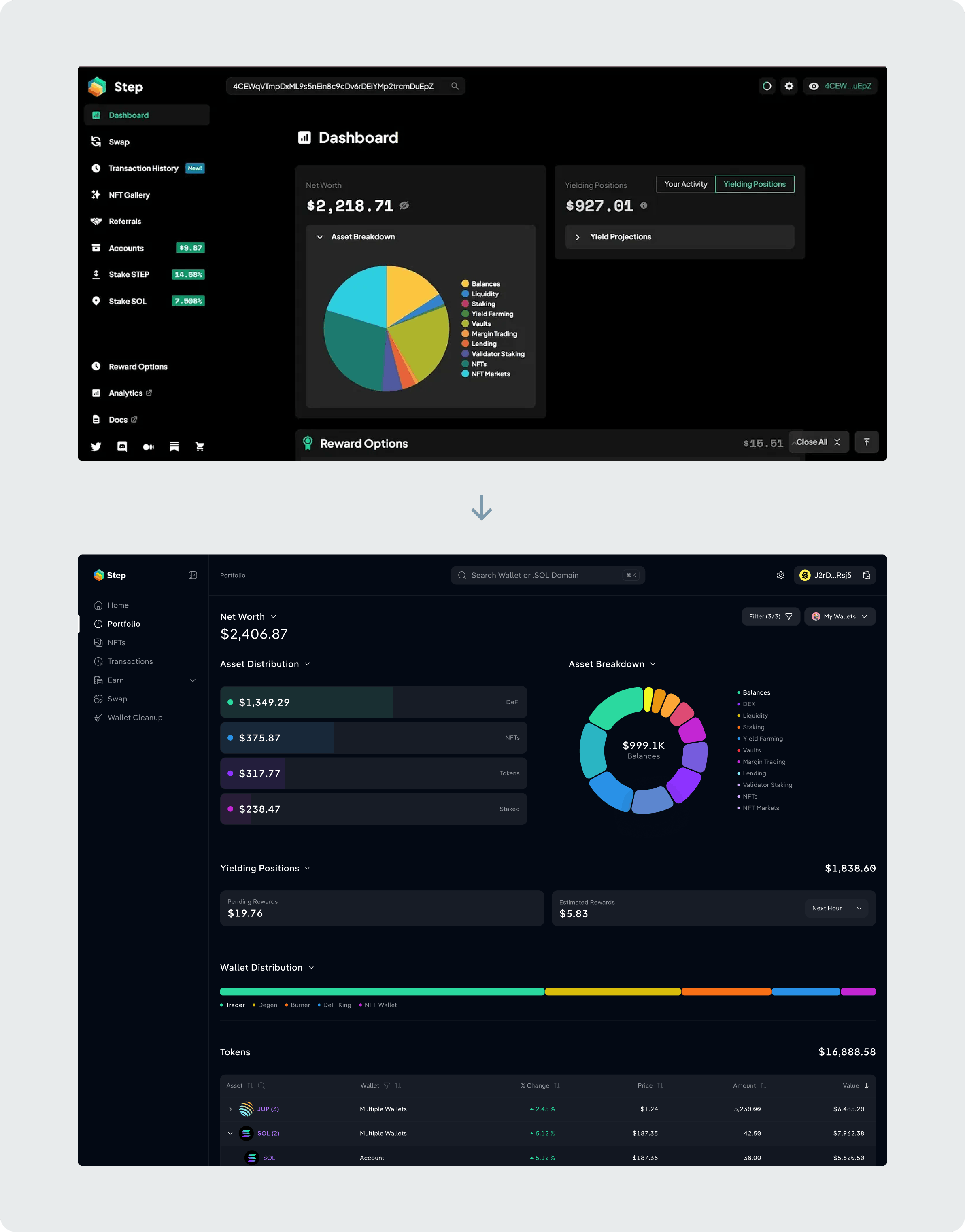
From feature-heavy to more focused
V2 had accumulated years of functionality. V3 gave the team an opportunity to reconsider what still deserved a place in the product rather than simply recreating everything. Some features were simplified, combined, moved closer to where users needed them, or removed entirely. The goal was to preserve the depth of Step without bringing back unnecessary complexity.
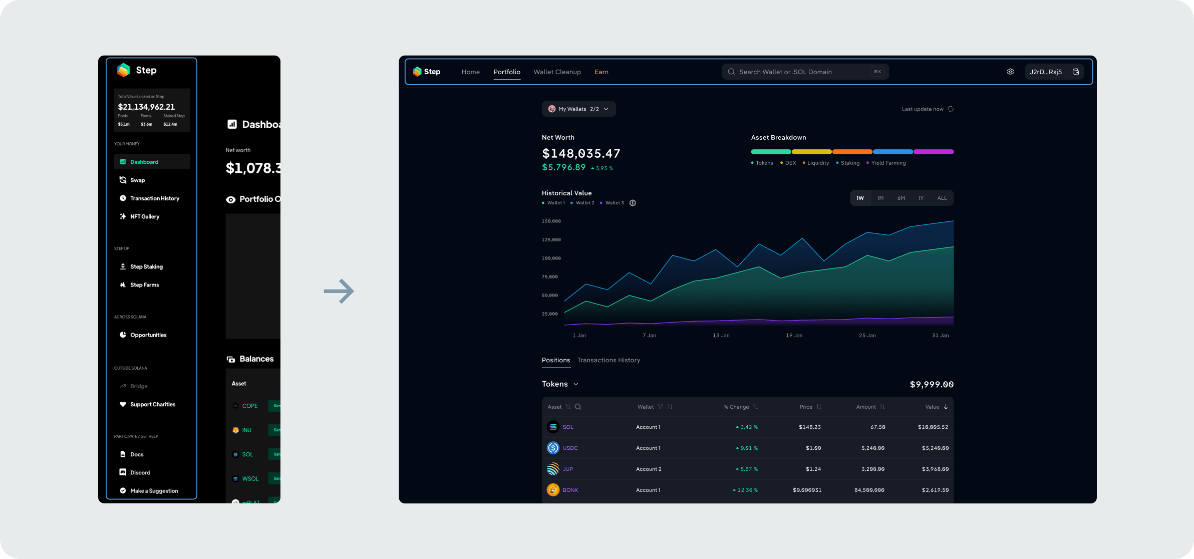
Replaced the feature-heavy sidebar with a focused top navigation, reducing clutter and making core areas easier to access.
Rebuilding key portfolio experiences
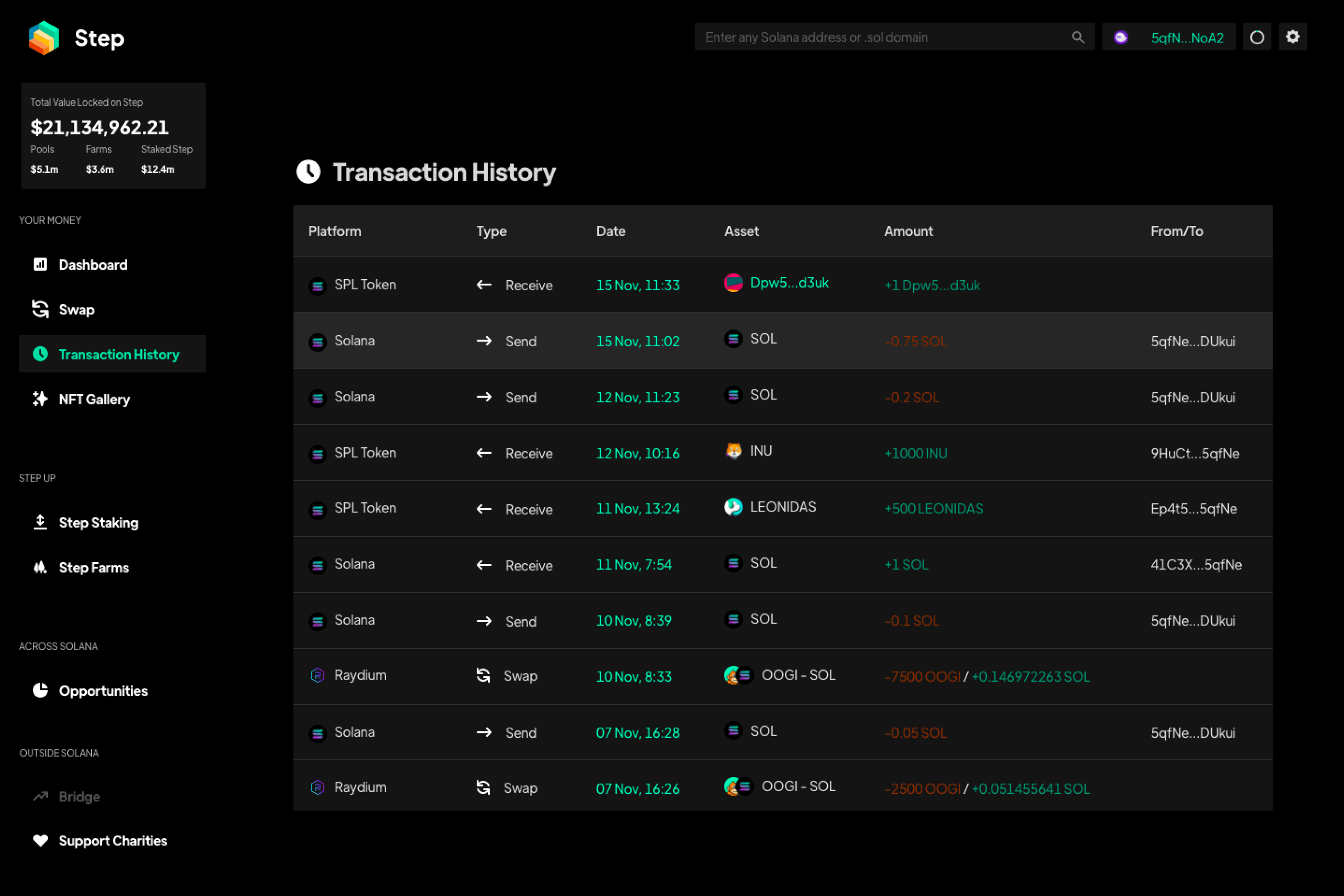
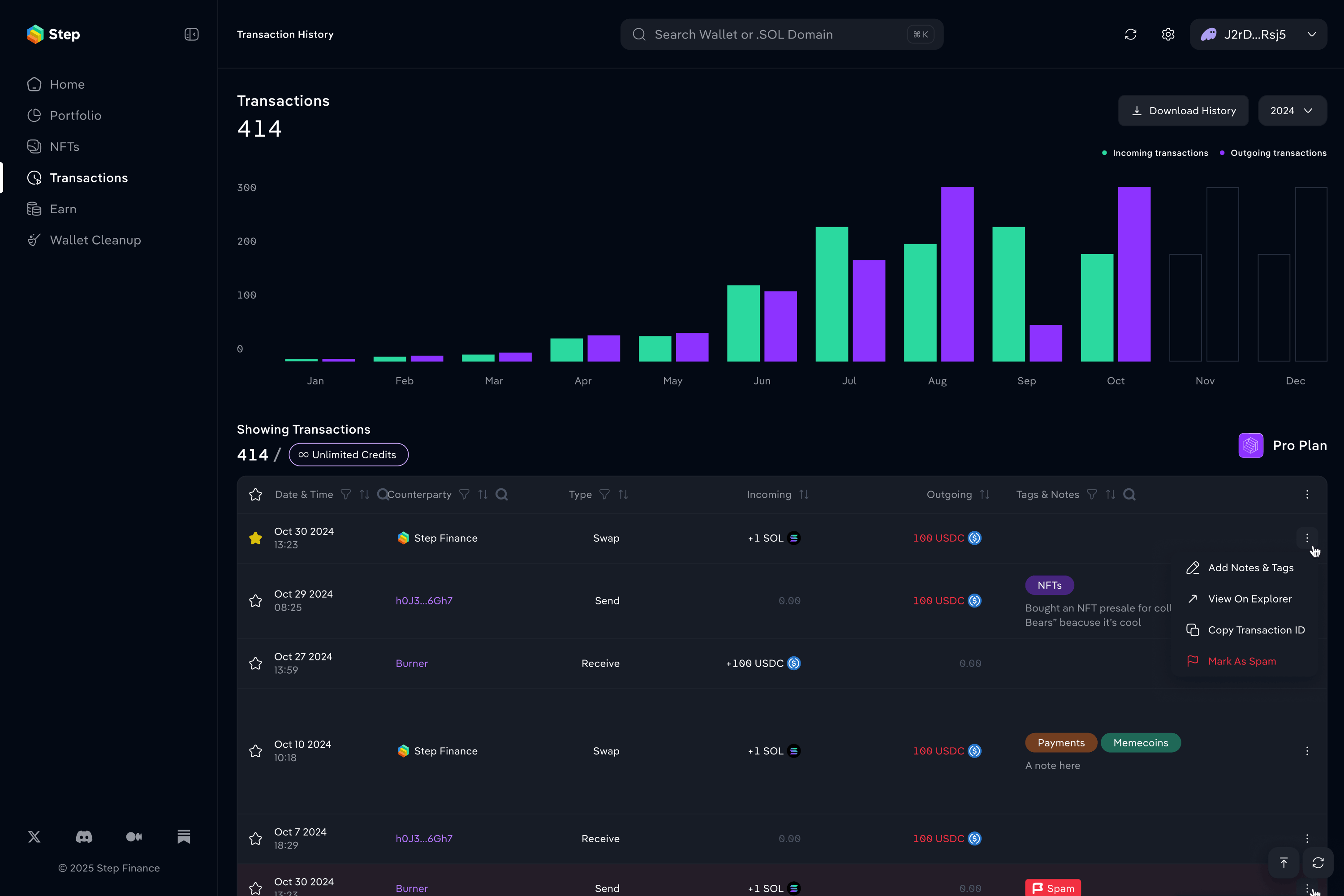
Transaction history V2 → V3. Added a monthly activity chart, tags and notes for better organization and the ability to download data.
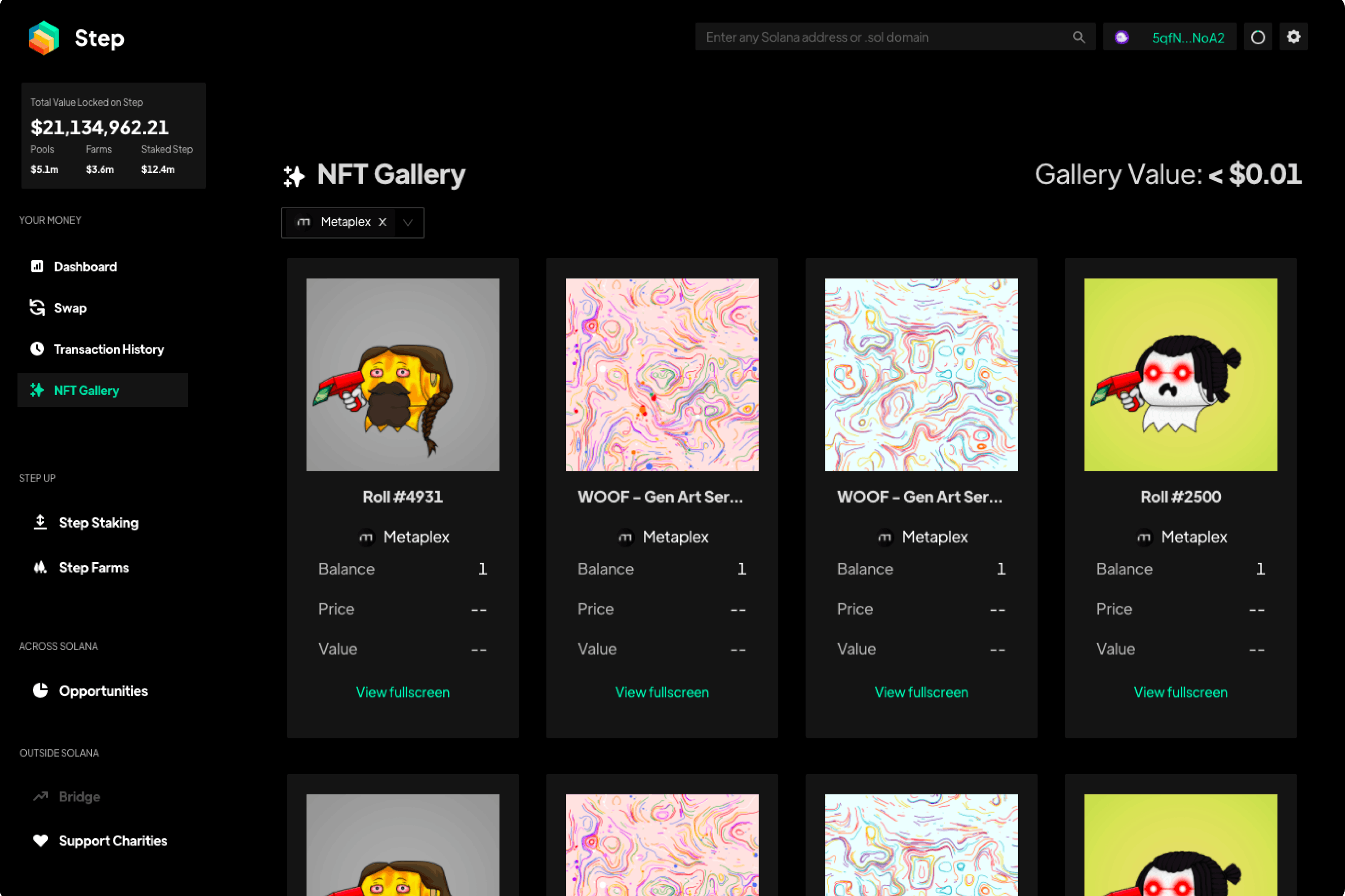
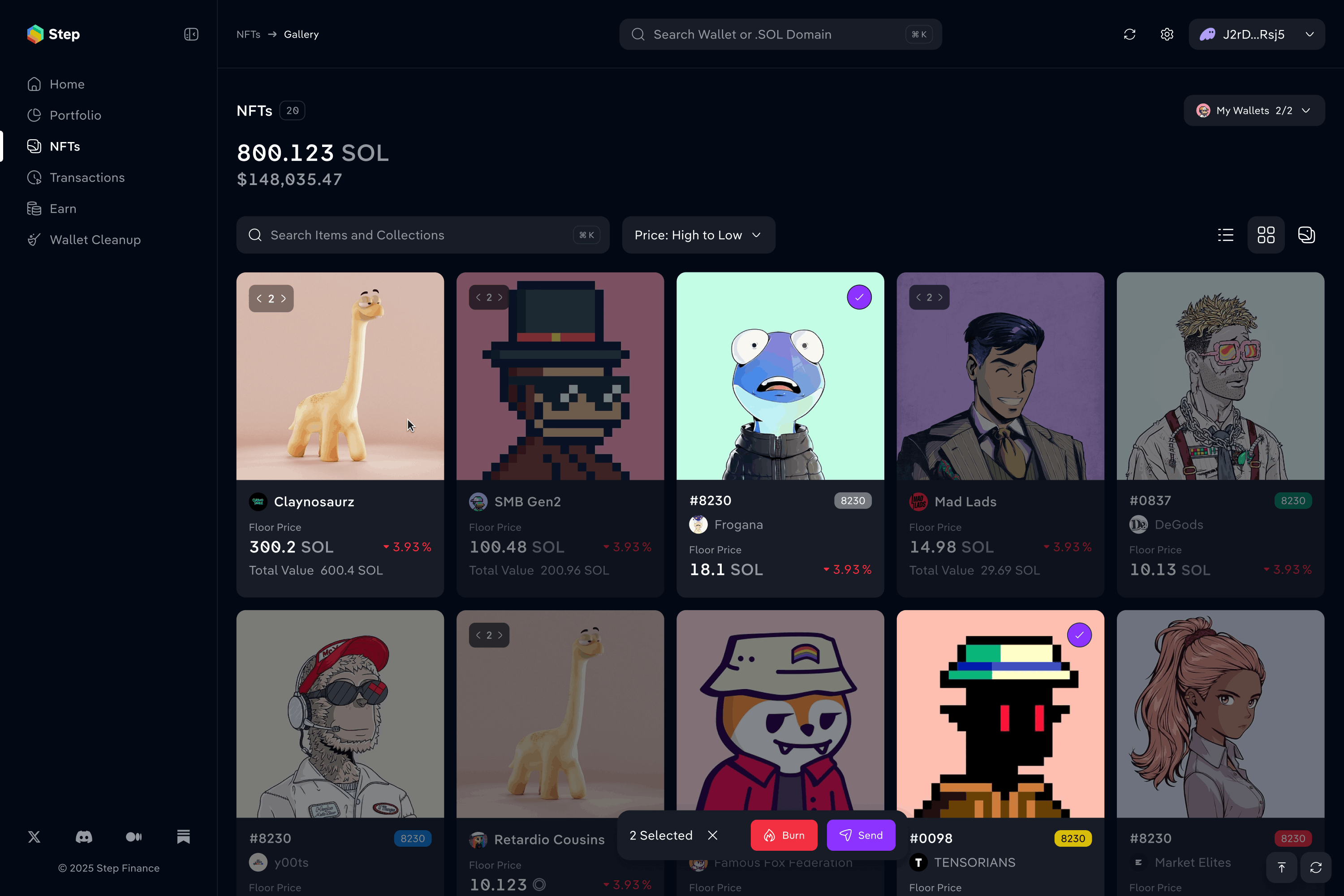
NFT gallery V2 → V3. Added multiple view modes, multi-selection and quick actions.
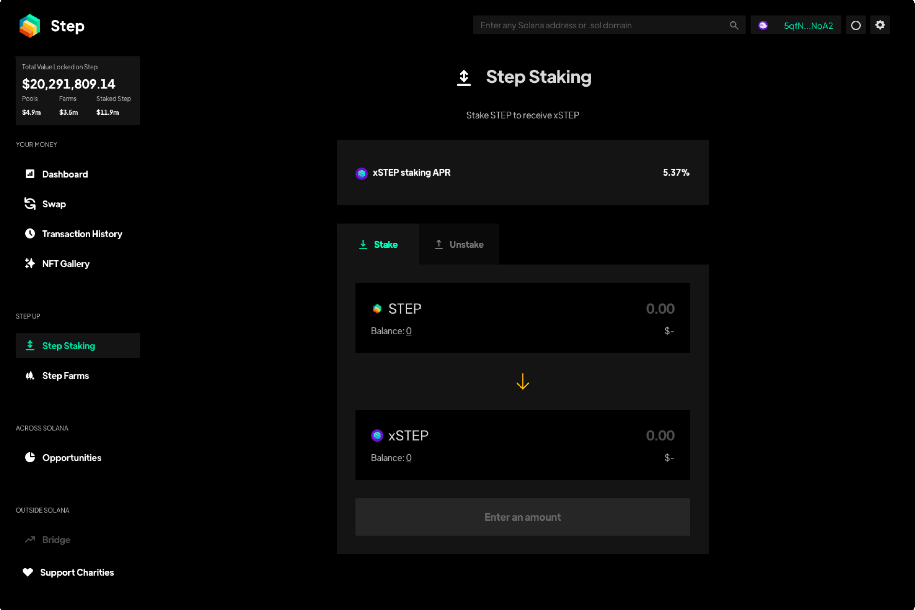
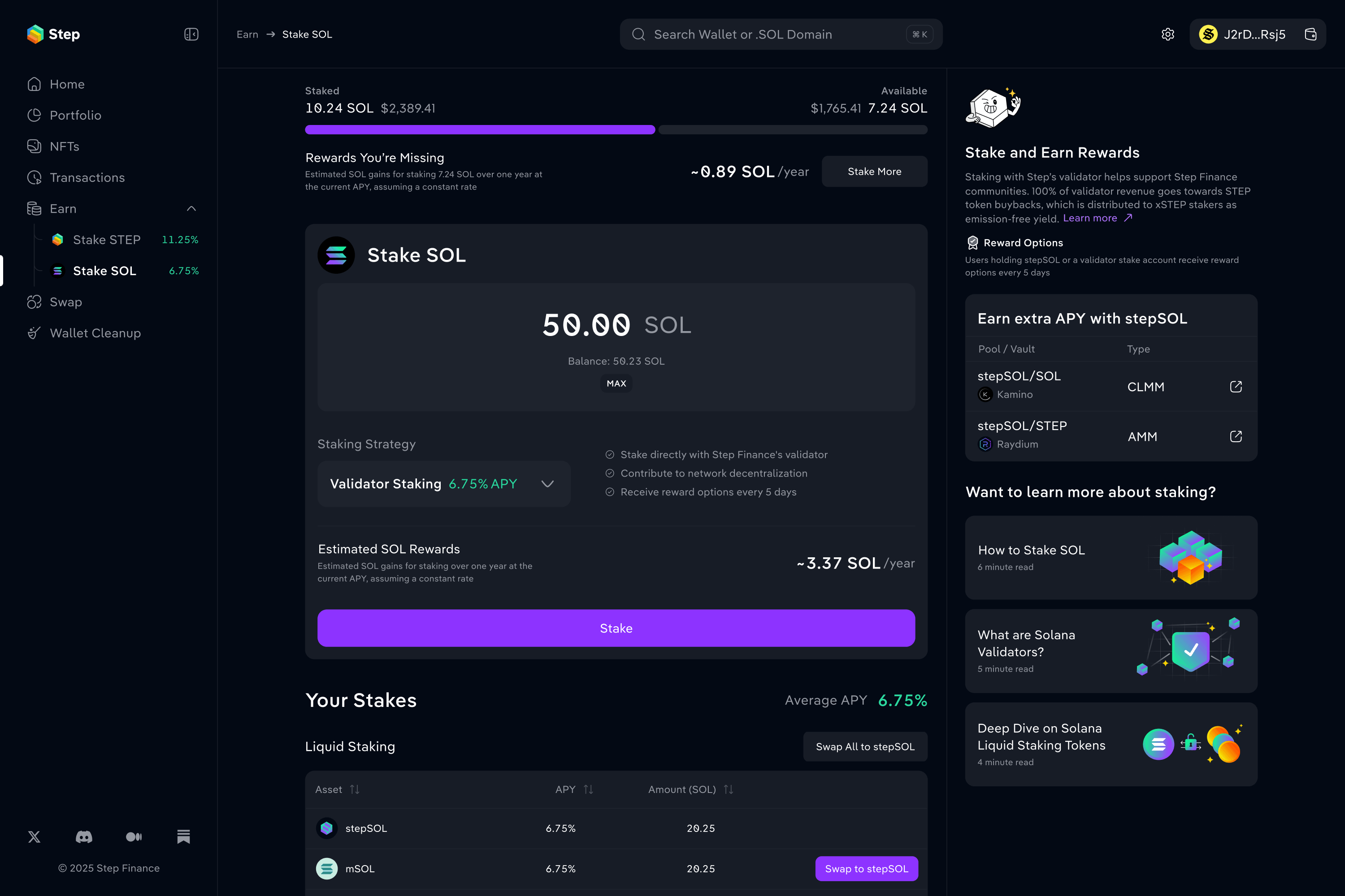
Staking. Added strategy options, estimated rewards, position tracking and educational content.
When privacy created too much friction
As Step expanded we introduced private user accounts to sync wallet collections, address book entries and preferences across devices without exposing users' wallet data.
The approach protected privacy but it came with significant UX costs. Users had to create and remember an additional password, and losing the password meant losing access to the encrypted profile data.
Also this introduced two parallel authentication flows: connecting a wallet to sign transactions and manage assets, and signing into a Step account to access saved data and preferences. Users didn’t always understand what each authentication method did or why they needed both.
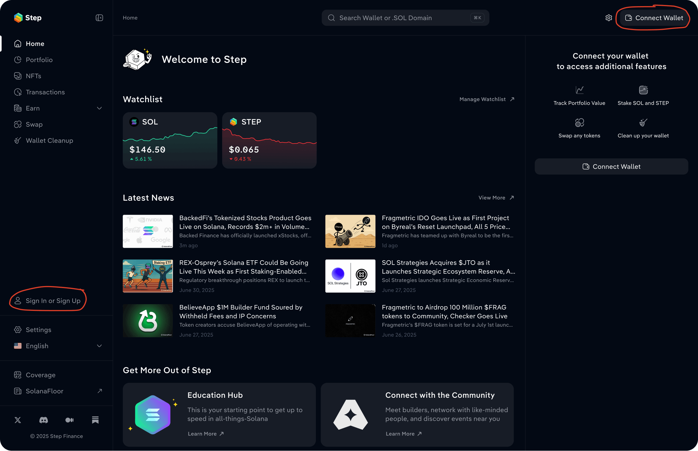
Over time it became clear that the added friction outweighed the value the feature provided, so we decided to remove the account system and simplify the experience.
This is a good example of a broader lesson from the redesign: not every technically robust solution makes for a better product. Sometimes improving the experience means removing a feature altogether.
The result
I helped evolve the dashboard into a more complete and cohesive product: simplifying core experiences, introducing new functionality, and expanding the design system while preserving the depth Step users valued.
Next project

Built the product experience behind PlaySolana's gaming ecosystem
Designed everything from the console OS to gamer platforms and developer tools, and built a scalable design system to keep the experience consistent.View Case Study